On this page
Aim: As a user, I want to change the admin boundaries and see how that affects key indicators, including population and voter count.
In this tutorial, you will work through the above requirement using various Sweet functionalities. Before starting the tutorial, you will need to activate the template.
Instructions on how to do this can be found here. Once the template is activated, you can begin the first tutorial.
Rules
Rules are an integral part of Sweet and help to ensure that the data you collect and edit adheres to your business rules. There are four types of rules you can apply:
- Spatial Rules
- Attribute Rules
- Action Rules
- Trigger Rules
In the following tutorial, we are going to be focused on introducing Spatial Rules.
Spatial Rules
- Create the Boundary Management Tutorial.
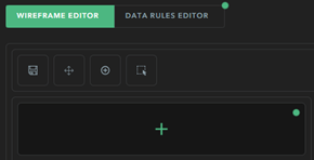
- Open the Data Rules Editor.
- For the Ealing London District layer, toggle off the editing and deleting permissions so users cannot edit or delete features.
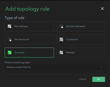
- Choose Topology from the Data Rules Panel.
- There are options for single-layer and multi-layer topology rules. Set a single-layer topology rule that prevents Wards from having holes, being multipart, and overlapping one another.
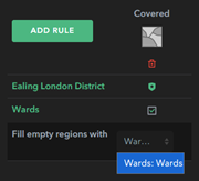
- Set a multi-layer rule so that Ealing London District must be covered by Wards. Select Covered and set Ealing London District as the parent containing layer. Tick Wards and select it from the Fill empty regions with dropdown.
- Save and launch the app.
- Try to create a Ward outside of the boundary. Notice that it will not successfully complete because there is no Local Authority District underneath.
- Select a Ward and try to delete it. Observe that Sweet creates a new Ward to replace it, as all Local Authority Districts must be covered by Wards.
- Select an existing Ward and reshape its boundaries. Select the neighbouring polygon and see how Sweet reshapes both to prevent overlaps.
- Change Create into Create Cut mode.
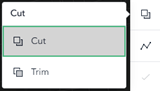
- Try to create a new Ward and observe how it cuts into the existing Wards.
Edit with Insight
Getting the right information at the right time is an important concept within Sweet. This is achieved by presenting a user with appropriate feedback. There are several ways this feedback can be presented to a user. For example, when an overlap happens between two features and there is a spatial rule which prevents this from happening, Sweet will flash the feature orange, automatically reshape the feature, and give the user a message on the footer to say what has happened.
- Sweet generated feedback
- Charts
- On the map feedback
- Messages
The following tutorial focuses on Charts.
- Open the Wireframe Editor for the Boundary Management Tutorial.
- Add a New Chart Panel.
- Select Custom, name the Panel ‘Statistics,’ and give it an appropriate icon.
- Open the Panel Editor and add a bar chart.
- Give the Chart a title of ‘Property Counts’.
- Under data, select EDIT SCRIPT and construct the following expression using the instructions provided within the script. You will need to use the Profile Variables and Functions found on the right-hand side to help you:
// This script is used to populate a graph with a property count per ward in the London Ealing Borough var currentWards = // Enter the wards layer here *In Profile variables check $map // Get a featureSet with details of the properties in the ward var props = // search for 'feature set by portal item' in functions and fill the function with the following details: '154024f24d9147c2839fb73286bff1a7', 1, [], true // Create a function to return the number of properties in a ward function propCount(feat) { count(intersects(props, Geometry(feat))) } // Returns a short version of a ward name function shorten(feat) { return left(feat.Name, 6) } /* Add a new field to the wards table, using the propCount function to return a property count for each ward */ var propCountbyward = addField(currentWards, "propCount", propCount) propCountbyward = orderby(propCountbyward, "Name") /* Add another field to the table with a shortened version of the ward name, to make it easier to present as a table */ var result = addfield(propCountbyward, "SHORTNAME", shorten) result - Once you have configured your script, save and open appearance.
- Add SHORTNAME to the label series field, propCount to the Value field, and ‘Property Count’ as the Label.
- Open Refresh and choose to recalculate based on data changes to Wards.
- Open No data and choose to Hide Chart.
- Save and launch the app.
- Open the Statistics panel; you should see a chart like the following.

Deployment
Templates allow you to make your app available to a group or to your entire organisation. By making it into a template, it allows the people you share it with to make their own data or point it at the data you’ve created.
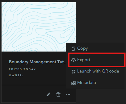
- Open the Sweet builder and find your Boundary Management Tutorial application.
- Select the three dots to expand the options menu.
- Choose Export and Export as template.
- Enter the required metadata, including Name and Tags.
- Choose whether or not to include the data.
- Once published, go to Create a new app and select Find templates in your Portal.
- Here you will find your newly created template ready to use.